Refractives
2024
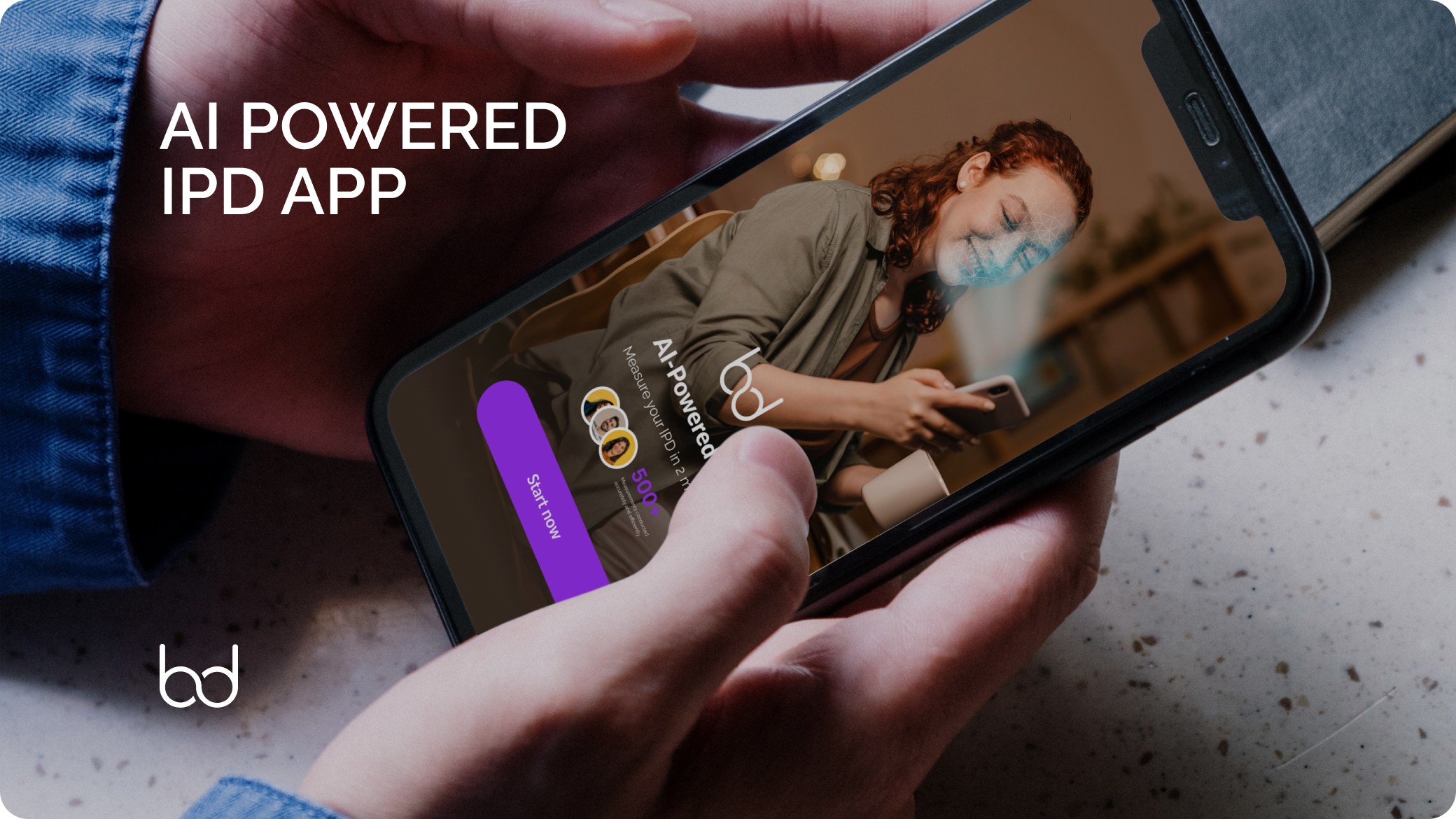
Craft a high-conversion landing page for Refractives, a newly developed loupe innovation. The goal was to introduce the product in a way that immediately captured attention, conveyed technical value, and created momentum towards pre-orders—without overloading the user.

Role: UX/UI Designer/Product Owner
Focus Areas: UX journey mapping, visual storytelling, interface design, responsive layout, performance and SEO optimisation
Challenge
While there were no legacy issues or content debts, the challenge was purely behavioural:
• How do we educate first-time visitors quickly and clearly?
• How do we build credibility around an unfamiliar innovation?
• How do we guide users from discovery to action in one seamless, lightweight journey?
Strategy and Design Approach
User Journey Mapping
Mapped out a 4-phase flow:
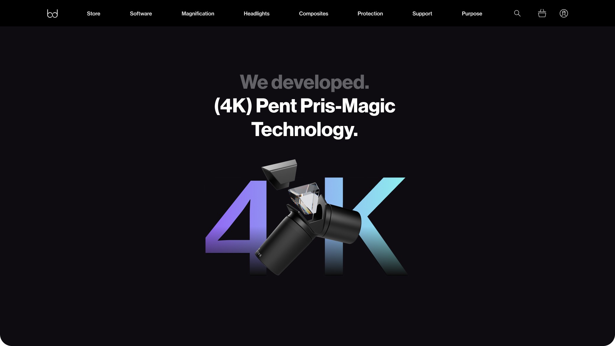
Hook – Lead with bold messaging around product uniqueness
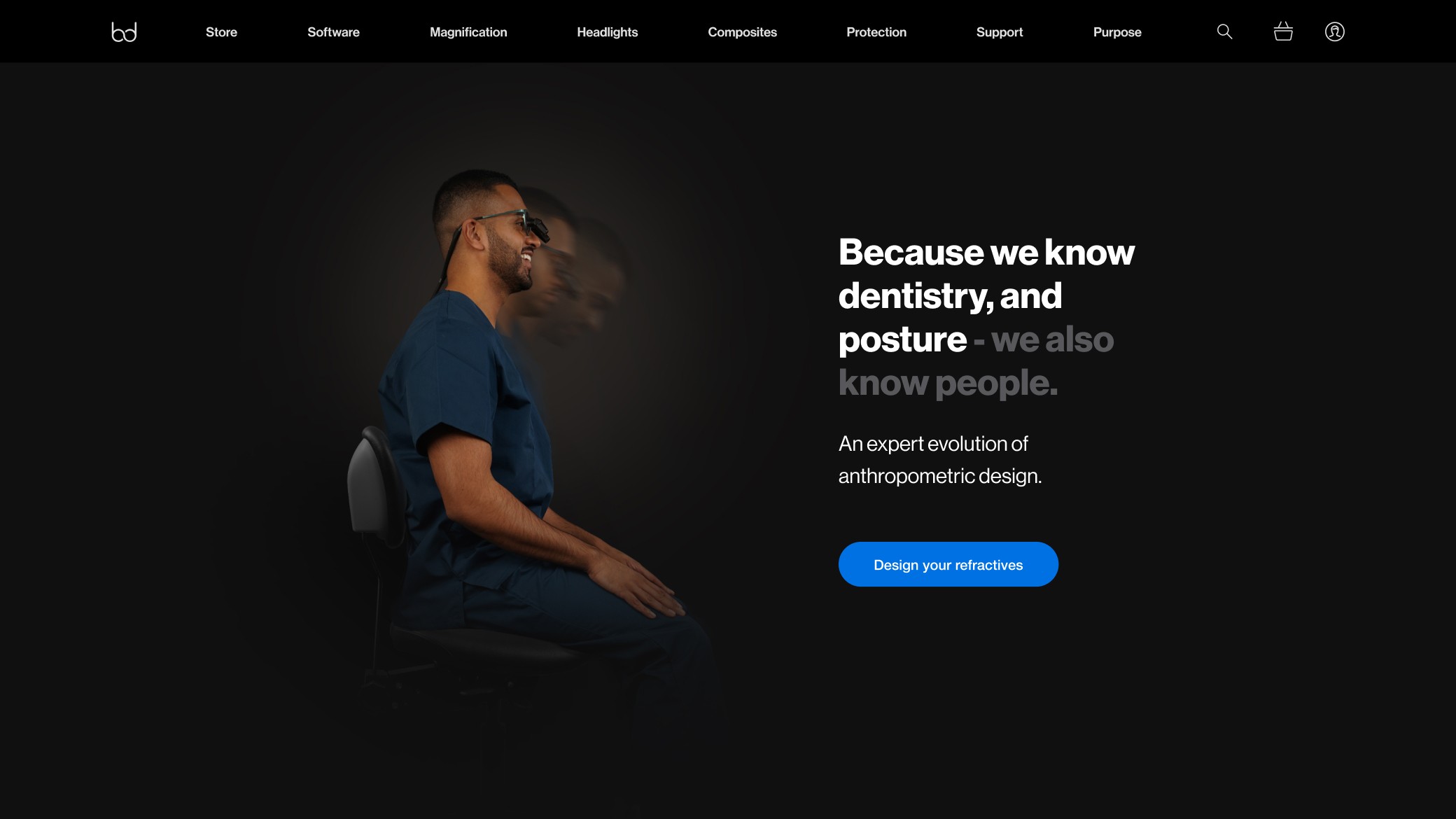
Trust – Show key product benefits via scannable blocks and microcopy
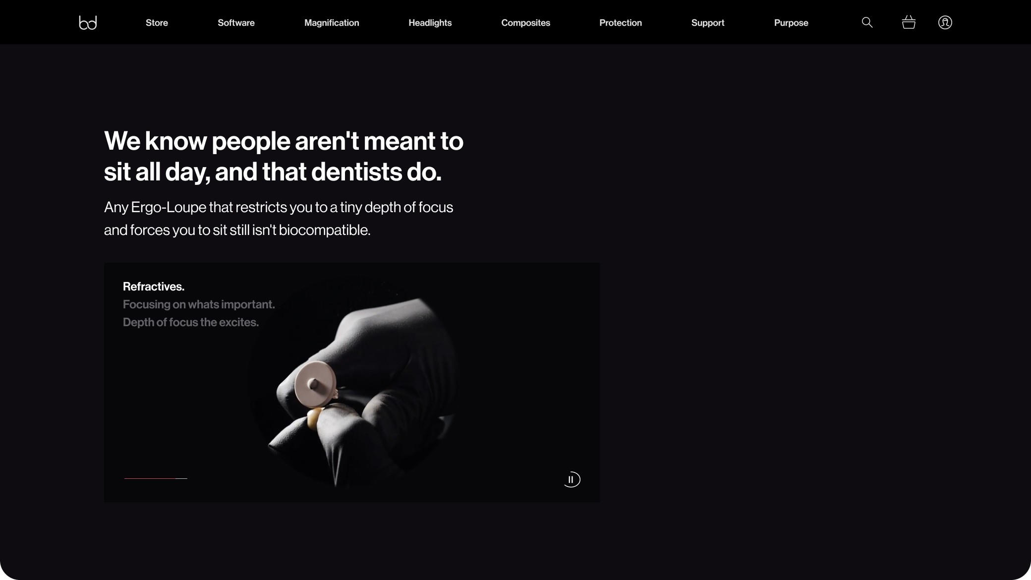
Evidence – Introduce social proof, lifestyle imagery, and use-cases
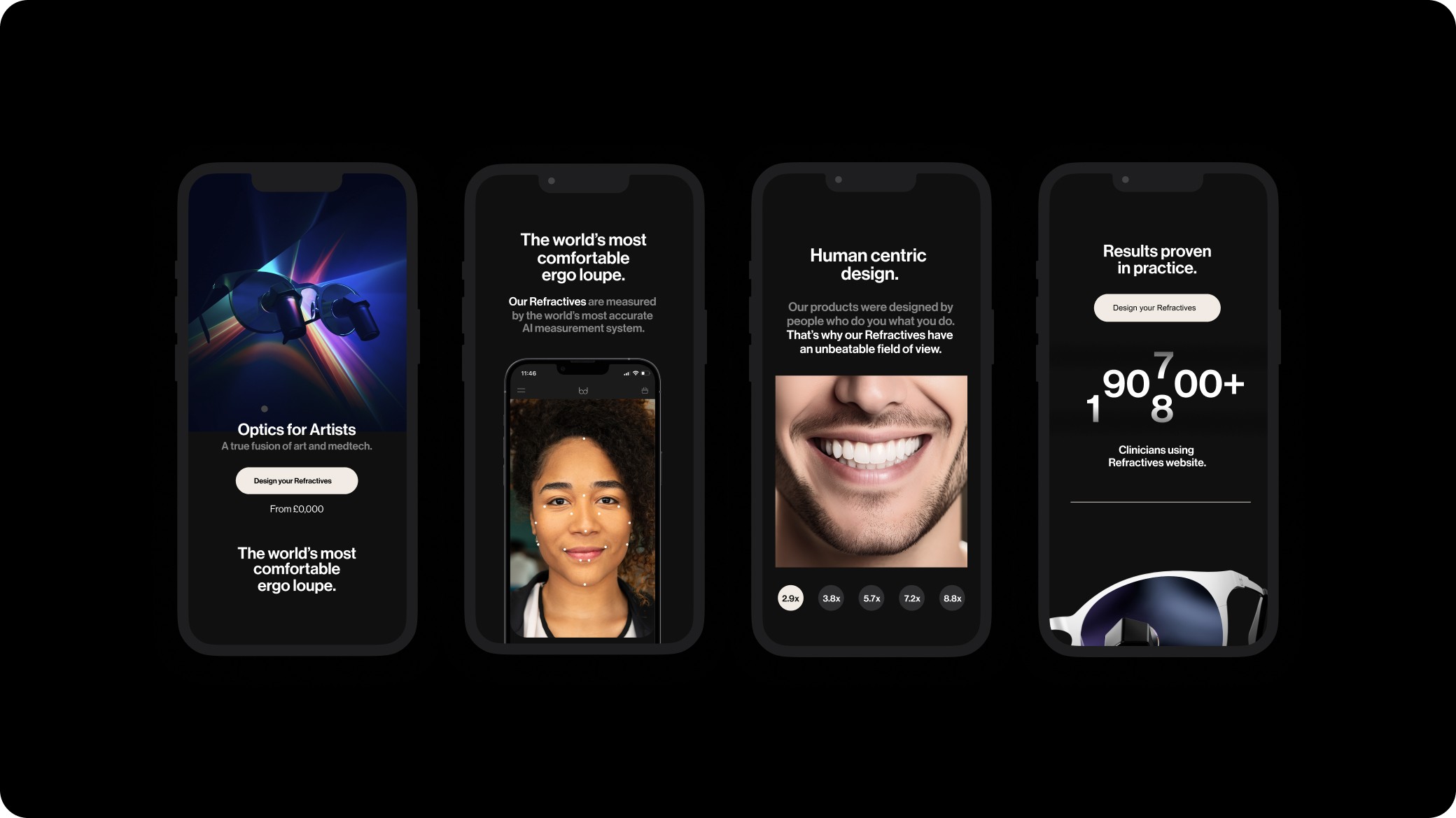
Action – End with a CTA
UX design Considerations
• Clear user journey
• Prioritised progressive disclosure so users could skim or dive deep
• Built mobile-first with strong tap targets, collapsible sections, and load-speed optimisation
• Ensured all headings, images, and copy were SEO-ready for organic performance
Visual Language
• Leaned on clinical modernity mixed with minimal human warmth—balancing innovation with relatability
• Designed a visual hierarchy that let benefits speak before features
Outcomes
40% increase in session duration compared to other pages on site
+28% form conversion rate from unique visitors
Page indexed and ranking for branded keywords within 30 days