Bryant Dental
2024
As the sole UI/UX Designer and acting Product Owner, I led the end-to-end strategy, user experience design, and cross-functional collaboration for Bryant Dental’s Refractives Configurator — a custom product tool designed to simplify and personalise the purchasing journey for high-end dental loupes. This wasn’t just about clean design or technical functionality. The real challenge was translating a deeply technical, clinician-specific product into a streamlined, consumer-friendly experience — all while aligning with Bryant Dental’s premium branding and e-commerce ambitions.
Role: UX/UI Designer/Product Owner
Product Owner:
Defined the product vision and roadmap in partnership with internal stakeholders.
Aligned product requirements with business goals through regular sprint planning and backlog grooming.
Facilitated feedback loops between developers, data scientists, and internal stakeholders.
Managed project prioritisation and milestones through agile ceremonies and decision-making frameworks.
UI/UX Designer:
Conducted research and customer journey mapping to define key experience touchpoints.
Created low-to-high fidelity wireframes, prototypes, and visual UI assets.
Led the design system and component documentation for developer handoff.
Collaborated with in-house developers and data scientists to ensure experience fidelity.
Challenge:
Bryant Dental needed a user-centric way to visualise and customise their range of dental loupes, which traditionally required specialist knowledge and manual configuration. Their audience — mostly clinicians and dental students — often found the purchase journey overly technical, fragmented, and visually underwhelming.
We needed to simplify and humanise the experience, without compromising on the configurability or clinical precision their products demand.
Goals
Reduce friction in the loupe selection and purchasing process.
Introduce visual configurability: Allow users to see what they’re building.
Drive conversions via better engagement and personalisation.
Consolidate branding and product interaction into a cohesive digital journey.
Research & Discovery
Reviewed competitor experiences across high-value, high-customisation products (e.g. eyewear, sports gear, luxury watches).
Mapped out existing user journeys, identifying friction points and content gaps.
Conducted internal interviews and stakeholder workshops to surface business priorities and data-driven insights.
Customer Journey Mapping
We mapped both pre-configurator journeys and configurator user flows to understand where engagement dropped and what information users needed most.
This process revealed a need to front-load visual previews, surface core feature comparisons, and simplify clinical terminology into everyday language.
Design Strategy
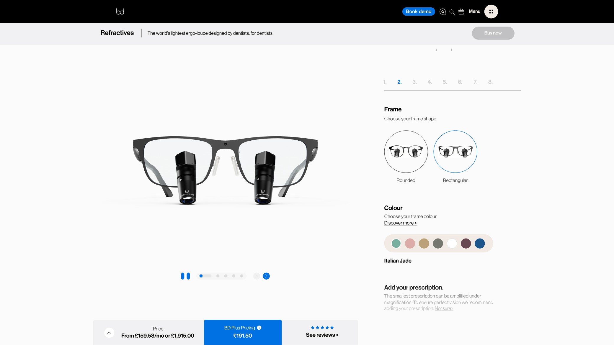
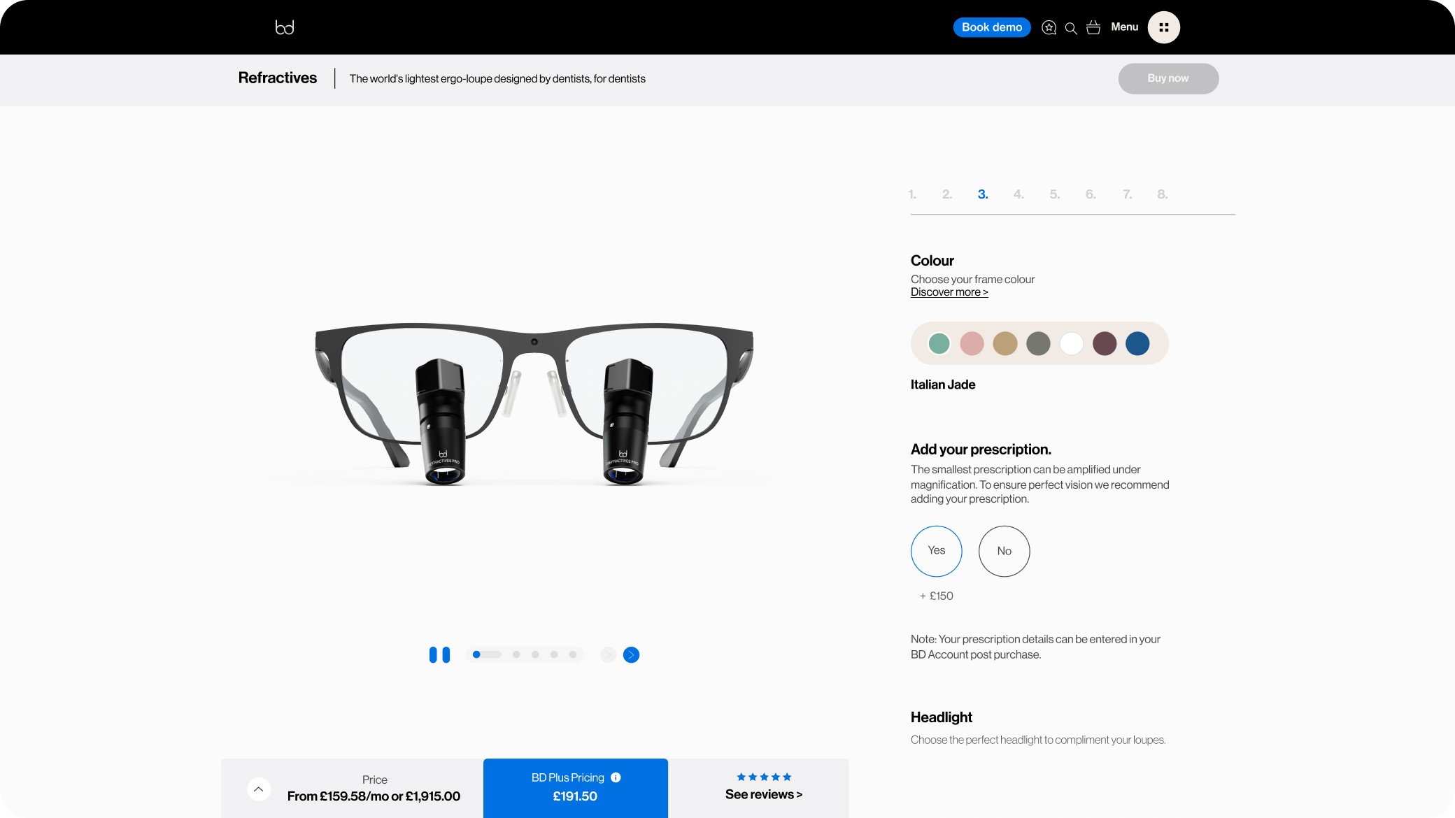
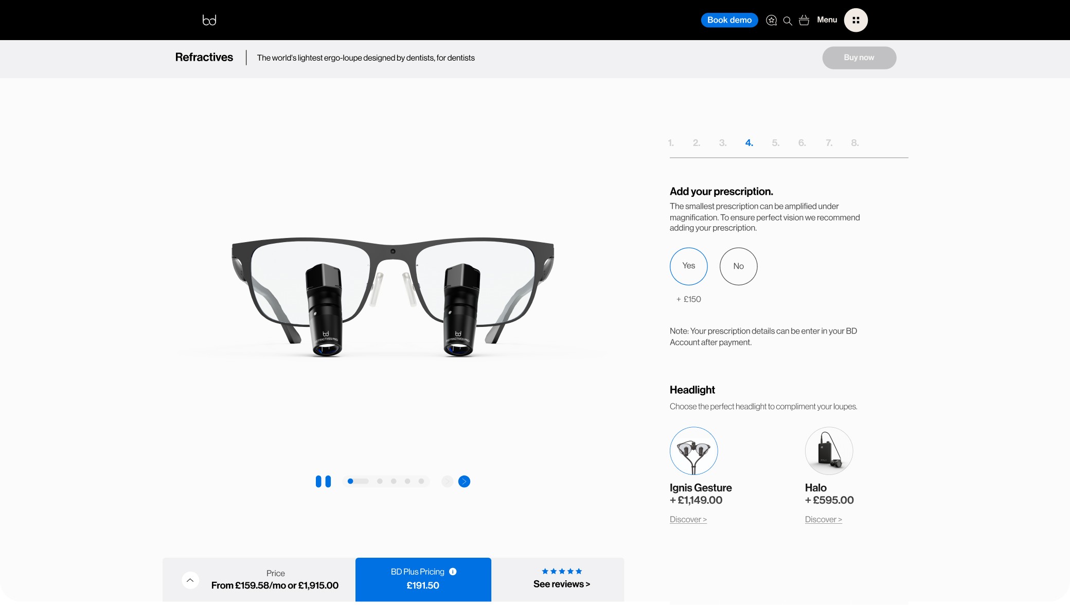
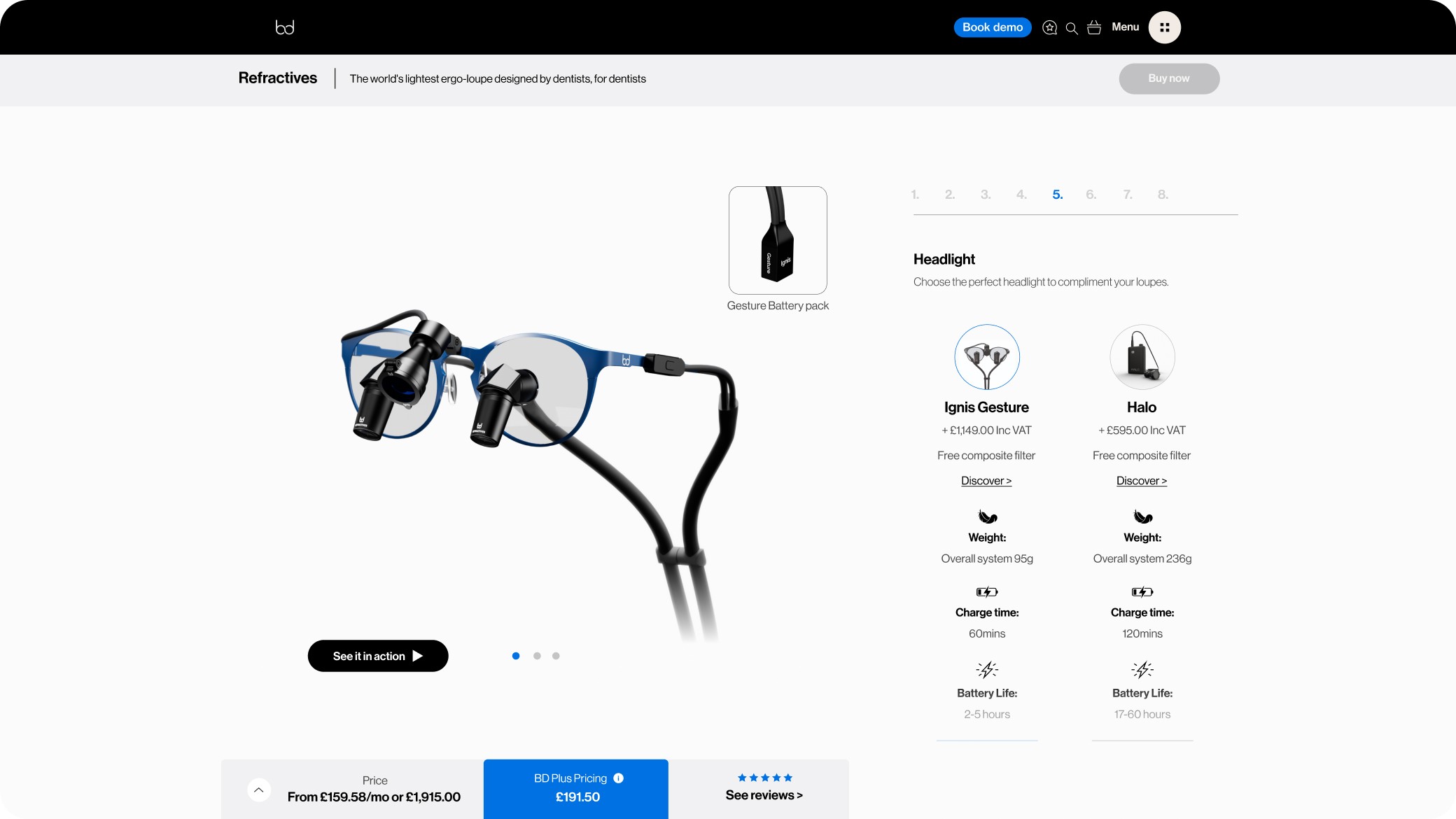
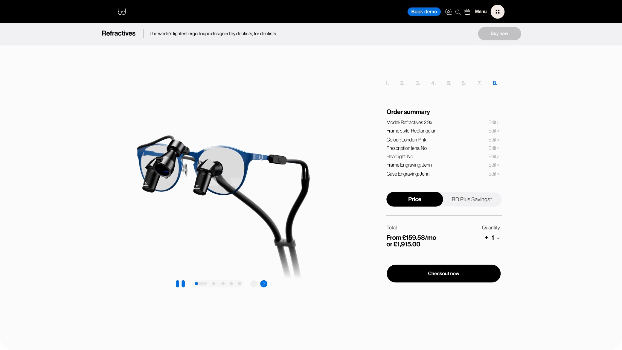
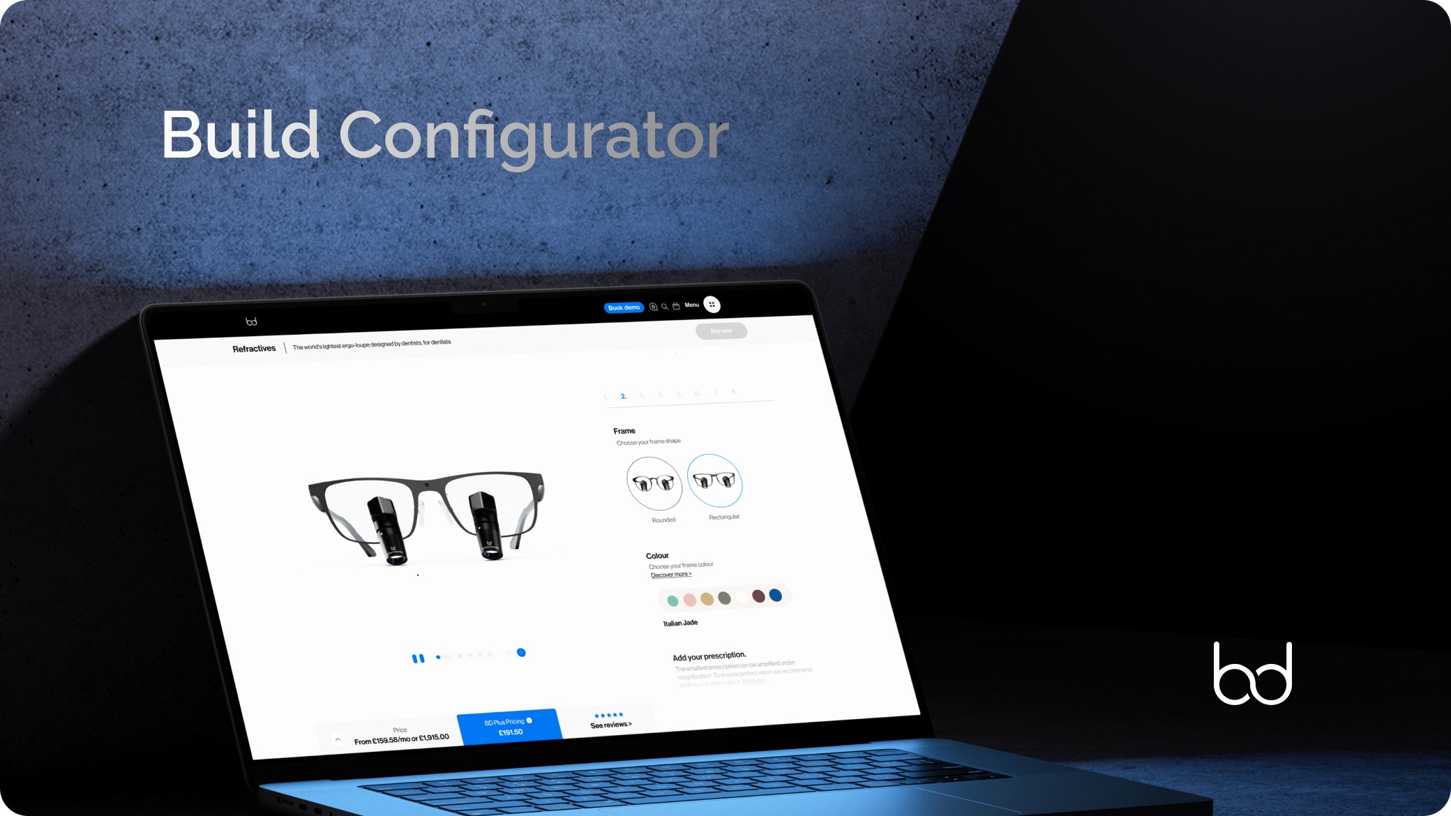
The configurator was broken down into modular steps, allowing users to:
Select loupe type
Adjust magnification and frame preferences.
Preview real-time updates to their selections.
Understand benefits in a simplified, visual language.
Key Features
Real-time visual updates based on user choices.
Inline guidance and tooltips for technical terms.
Progressive disclosure of complexity: starting simple, revealing depth when needed.
Mobile-first responsive behaviour, given the user base includes students and on-the-go clinicians.
UI Execution
I designed the experience to feel premium yet approachable, aligning with the brand’s clinical expertise while creating a visually engaging product journey. Typography, layout, and interaction patterns were refined to:
Reduce cognitive load.
Increase scannability.
Maintain accessibility standards (e.g. colour contrast, tap targets, font sizing).
We also created a design system with reusable components, ensuring scalability across future product tools and landing pages.
Collaboration & Handoff
As Product Owner, I worked closely with in-house developers and data scientists to:
Clarify technical constraints early in the process.
Prioritise MVP features through MoSCoW mapping.
Define success metrics based on analytics and A/B testing frameworks.
Maintain velocity and alignment through weekly stand-ups and retrospectives.
I also provided detailed documentation and Figma libraries to support efficient implementation.
Outcomes
Reduction in bounce rates on product pages by 27%.
Increase in conversion rate for loupe customisation journeys by 34%.
Improved average session time and drop-off reduction through visual engagement.
More importantly, the tool laid the foundation for scalable customisation across the product line, positioning Bryant Dental as an innovator in user-centred, high-tech optics.
This project pushed me to blend visionary product thinking with deep UX execution. It required careful balancing between technical feasibility, clinical precision, and intuitive user flow. My dual role enabled me to bridge the gap between teams, ensuring that design wasn’t just aesthetic — it was strategic, measurable, and transformative.